Three years after its transformation into a Business Aviation player, Bombardier today unveiled a new corporate logo saying the revamp will reflect company’s current focus while recognizing its past.
The new Mach logo was unveiled to employees during an event at the company’s headquarters in Dorval.
As per Bombardier, it has successfully moves forward as a company with a sole focus on designing, building and servicing the world’s best business jets, the new brand identity will reinforce and propel the company’s unique approach to its customers and stakeholders—putting people at the centre and instilling a one-of-a-kind sense of family.
Ève Laurier, vice-president of communications, marketing and public affairs, who oversaw the rebranding process, said ,
“Bombardier has transformed extensively in the last four years,” “We thought now the time is right to put a visual to what it is we do, which is business aviation.”
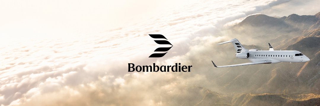
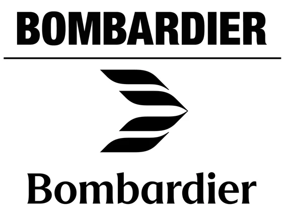
The new logo, called the Bombardier Mach, represents four wings of an airplane overlayed to form a sort of sideways V, making it look like two airplane wings. The shape of a jet’s nose and fuselage is visible in the white space in the middle of the graphic.
“It features the silhouette of an aircraft breaking the sound barrier — an ode to the ambition and innovative spirit of our people — while the strokes of wind over an aircraft reference our heritage,” the company wrote in a statement.
Éric Martel, President and CEO, Bombardier said ,
“Today is a historic moment for more than 18,000 incredibly talented and passionate Bombardier team members. Our iconic company is looking forward with confidence and an innovative spirit, two notions captured elegantly in our new logo and brand evolution,”
“Our clients worldwide are leaders who shape the world and who expect us to deliver a truly memorable experience. When asking them what sets Bombardier apart, the notion of ‘like family’ comes back time and again as a true differentiator."
While the company has used symbols in the past, most recently its main logo was just the name Bombardier, in all capital letters.
The new logo is accompanied by a new font for the company’s name, which will be displayed with a capital B and lowercase letters for the rest, to denote that Bombardier is the name of the family that founded the company. The curves in the semi-serif letters also emulate the curves in the Mach symbol.
Laurier added:
“Bombardier’s new impactful logo echoes the pride and passion we all have for our industry and will further be supported by a suite of evocative imagery featuring Bombardier’s own team members at the peak of their respective craft. Their work to elevate performance and sustainability in business aviation, services and defense continues to redefine the industry.”
“We’re calling it the Mach because last year we flew our Global 8000 at Mach 1, which is a first in business aviation,” Laurier said. “Our engineers are really proud of having been able to take a Global to supersonic (speed).”
It wasn’t long ago that Bombardier was in a Turmoil. Down with debt, the company made decision in February 2020 to dispose-off its rail division to France’s Alstom SA. At the same time, the company also sold off its C Series aircraft program to Airbus, which in now known as Airbus 220 series.
“We’ve gone through so much transformation and the company’s doing so well,” Laurier said. “We’ve been consistently delivering strong financial results, and signalling that with a new brand shows confidence.
“I think there will be a lot of pride associated with that moment, which is telling the world we’re looking toward the future. We’re happy and we’re proud of the brand. Our products are the best products of the world, so the brand needs to be able to stand with the best brands in the world.”
You may like to read.....